
Choosing the right colors for a web design is as important, as the graphics or content for it. Colors affect people differently. A user’s emotional reaction can impact a company’s image and brand. Colors make people happy, sad, relaxed, worried or even mad. Another good proof that colors have a huge impact on people, is the vast number of idioms.
The color evokes emotions of every user. Certainly, it is really necessary to take it into account, during the website development. Generally, colors are classified as “indifferent”, “warm” or ”cool”. Let’s look at all three groups of colors in more details, so you could use them as your web design tactics:
#1: Indifferent colors
- White means transparency and cleanliness. In oriental culture, it is associated with death. However, in Western culture, it usually symbolizes marriage and hope.
- Gray stands for reliability and conservatism. Its shades are mainly used for business wardrobe.
- Brown is about the Earth, home, and family
- Black, usually, stands for power, elegance, and sophistication. AIso is a color of death in Western culture.
#2: Warm Colors
- Red is the best color to attract people’s attention. This is why it’s often used for email advertising captions in order to emphasize certain info. The red color symbolizes anger, violence, passion and can actually increase people’s blood pressure.
- Yellow is ambivalently about cowardice and weakness as well as heat and happiness.
- Orange usually means harvesting, Halloween, and appetite.
- Pink is obviously about innocence, femininity, and romance
#3: Cool Colors
- Blue has a calming effect. It embodies intellect and trust. Many financial and medical institutions use blue themes. Blue can also suppress appetite.
- Green means envy, greed, and inexperience. At the same time, it stands for money and wealth.
- Violet is usually associated with creativity. The interesting fact is that the dark shades of this color were once registered for The Royal Family, whilst the light ones symbolize romance.
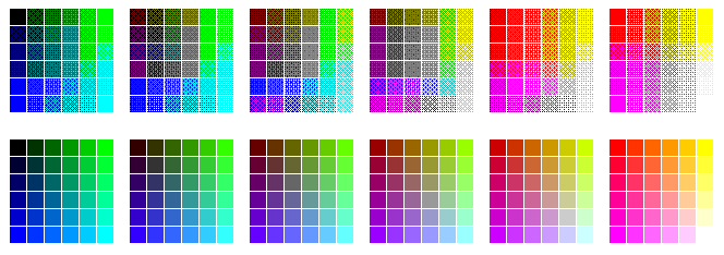
#4: Web Safe Colors
LCD vacuum tubes and plasma screens display colors differently. However, there are 216 colors, which you can see on any screen and each browser, looking pretty the same. They are called web safe colors. The importance of color combinations on a website is also a reason to choose web safe colors.
#5: Color Schemes in web design
Color schemes can consist of a single color, additional or contrasting colors.
- Additional colors. This scheme, obviously, contains two or more colors. They look good together and provide a pleasant combination, which seems attractive to most people. There’s the main color and the second paint is used to complete the dominant one.
- A single color is used for different shades and intensity over the white background. For instance, if the red color gamma is used, it is possible to use all the colors, from light pink to dark red.
- Contrasting colors. These two or more dominant colors are used to create an impression of excitement. For example, the dark blue background color of the page with the dark red border around the white field with black text is a classic contract scheme. Web designers have to be careful with using contrasting colors, as some combinations can lead to “explosion”. Thus, some red text on the blue background can have a rather harmful impact on users’ eyes and cause some negative feelings.
#6: A few additional handy tactics:
- The text has to be readable. Black over white is a default choice, however, there are more reasonable options. For example, white and yellow look good on the dark background. Meanwhile, yellow, green and gray is not suitable here.
- Anyway, reasonable colors are those ones which are attractive and pleasing to the eye.
- Color rendering is actually about what an author wants to say.
- Web-safe colors are more preferable.
- The text background color should be less intensive.
- Visual corporate identity is about the unified color scheme, as well.
To sum up, colors are about emotions which come before rational thinking. This is a key point when choosing to create a positive first impression or the so-called small talk.
Searching for the best UI and UX designers or graphic designers? Contact Adoriasoft today to get a free consultancy or estimation of your project!